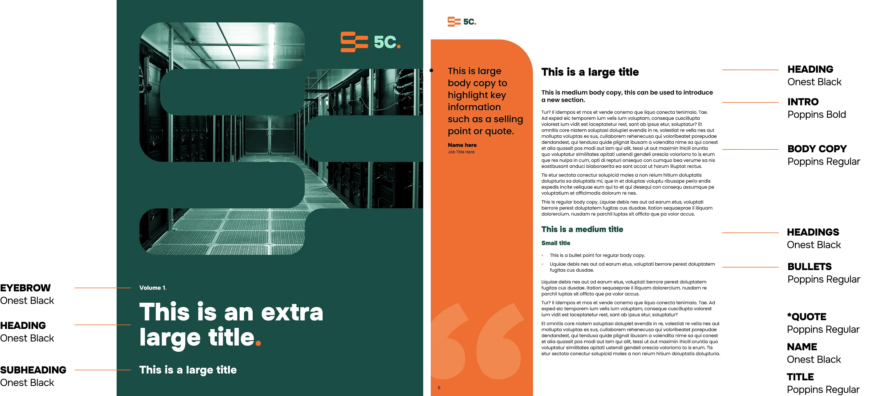
Typography.
Our typography reinforces the brand’s voice while ensuring clarity and legibility at every scale. This section covers our fonts and typographic rules, designed to support readability and the brand’s character.
Overview.
We use capitals in our headlines, and large text and sentence case everywhere else. All headlines are set slightly differently to the subheading and body copy.
On key details, periods and bullet points can be highlighted using the 5C Orange to mirror the logo design.
The Google fonts Onest and Poppins are available to download from the link below.
& Large Text
Heading Example Lorem Ipsum Dolor Sit Amet.
Lorem Ipsum Dolor Sit Amet
Body copy example lorem ipsum
dolor sit amet.
- Item A
Specification.
These specifications define how our fonts should be used across different text levels. These rules ensure our typography remains clear, consistent, and recognizable across all applications.
Hierarchy.
This example demonstrates how our typographic hierarchy works together in practice to create structure and ensure clarity.
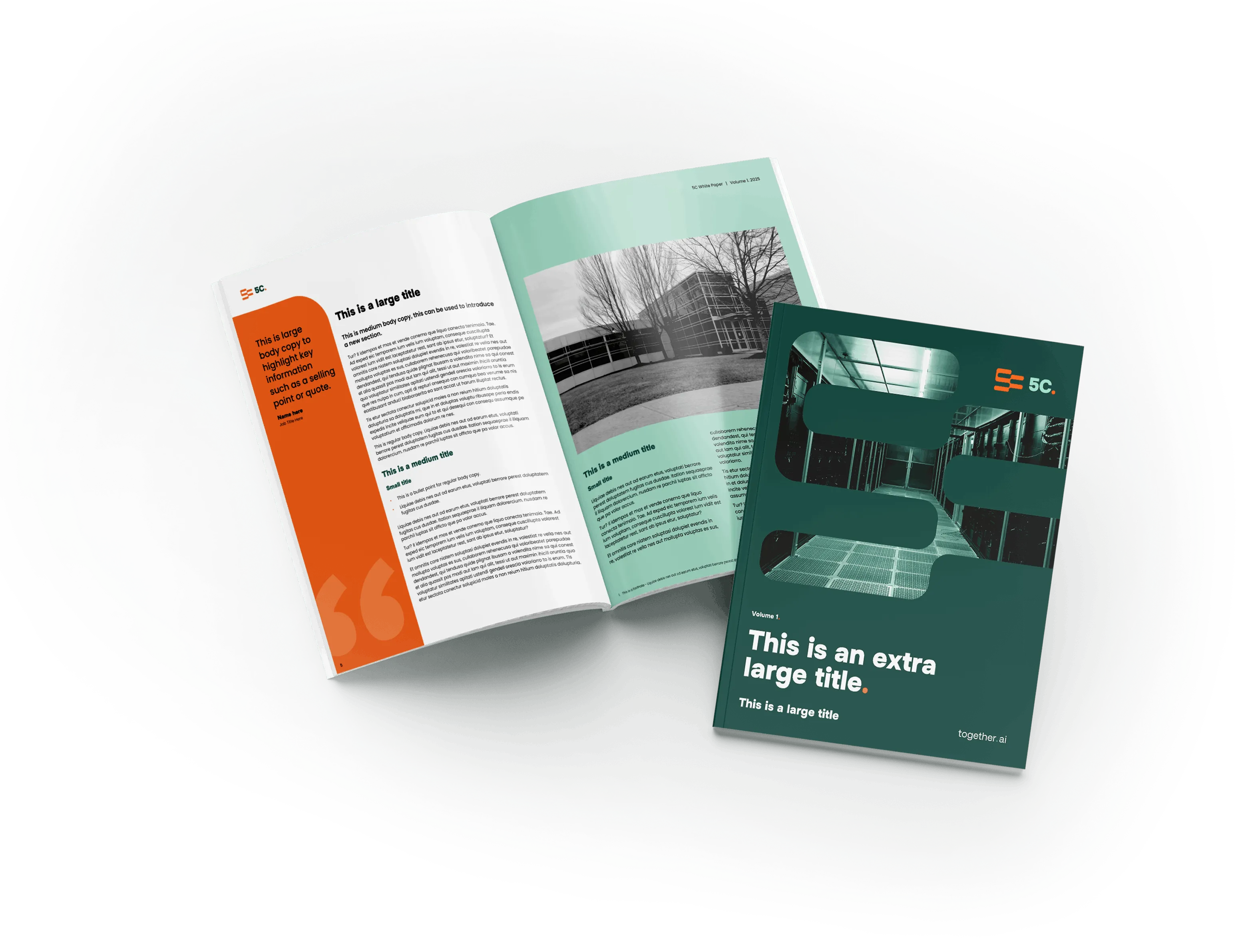
Typography In Action.
Examples showing our typography in use across key brand touchpoints.
AI Digital Infrastructure Provider.
Lorem ipsum dolor sit amet, consectetur adipiscing elit, sed do eiusmod tempor incididunt ut labore et dolore magna.
At the heart of our work, across both our Data Centers and Cloud divisions, we operate based on foundational pillars from which the 5Cs naturally emerge. Cost efficiency is embedded in each pillar, driving long-term value at every stage of large-scale Al digital infrastructure deployment.

We design and deploy the full purpose-built AI digital infrastructure stack—from data centers to compute clusters—for optimal cost and performance.
Ready for more?
Find out about the rest of our core visual elements and how to ensure clear, distinctive, and consistent branding across every touchpoint.
