Logo.
Our logo, monogram and wordmark form the cornerstone of our visual identity. This section outlines how to use them correctly, including approved versions, spacing, and placement to protect brand consistency.
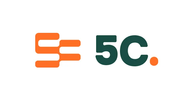
Logo Lock up.
Download LogosPrimary Logo
The primary logo includes both a monogram and wordmark. While the monogram may be used alone, the wordmark may not--the monogram must also be alongside it.
The wordmark is created from a custom font featuring custom glyphs and letter spacing. It should never be created from a font.
Clear Space and Sizing.
Clear space
X is equal to the height of the monogram.
A clear space of ½ X on each side allows suitable space for our logo.

Minimum Size
Ensure the lock up never goes smaller than 100px or 20mm in width and the monogram never goes smaller than 26px or 9mm in width.

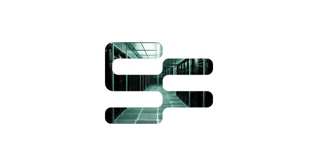
Monogram.
Download MonogramThe 5C monogram can be used as a separate device. Examples of this include use on merchandise as a device to hold imagery, or as a watermark to create depth. It can be cropped and rotated, however, the majority of the shape should remain visible.
Logo & Monogram Usage.
Correct Logo Usage
Examples of logo use that reflect the brand as intended. Use the logo in these ways to ensure clarity, consistency, and recognition.

light-colored background

or dark-colored background

detailed background

background with a tint overlay
Incorrect Logo Usage
Examples that distort, alter, or weaken the brand. Avoid these treatments to preserve the logo’s clarity and consistency.

the logo elements

or skew the logo


of the wordmark

of the logo elements

the monogram
on the logo

effects on the logo

the wordmark


Correct Monogram Usage
These examples show approved ways to use the monogram.


Incorrect Monogram Usage
These examples highlight common misuses of the monogram that should be avoided.

or alter the monogram

or skew the monogram


on the monogram


for the monogram

on a busy image
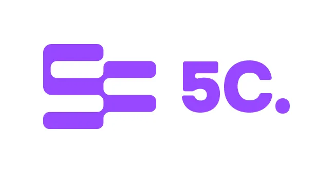
Logo Color Pairings.
Correct Logo Color Pairing


Incorrect Logo Color Pairing


Ready for more?
Find out about the rest of our core visual elements and how to ensure clear, distinctive, and consistent branding across every touchpoint.

